The Problem
Members were calling customer service to do things the portal was supposed to let them do alone. In 2023, fewer than one in five even used it.
<20%
of members used the portal
65%
who did use it struggled to navigate
62%
couldn't locate their own benefits or documents
The Challenge
How might we redesign the portal to help members feel informed and confident managing their benefits independently?

My Role
Led IA redesign end-to-end as sole designer, from audit through launch
Ran a 3-phase usability study
Conducted UX audit and competitive benchmarking across Aetna, Anthem, Cigna, United
Created usability workshops with the Customer Service team
Designed and launched the post-effect member portal
First Intervention
Nov 2023 – Jan 2024 · Launched April 2024
Restructuring the Portal
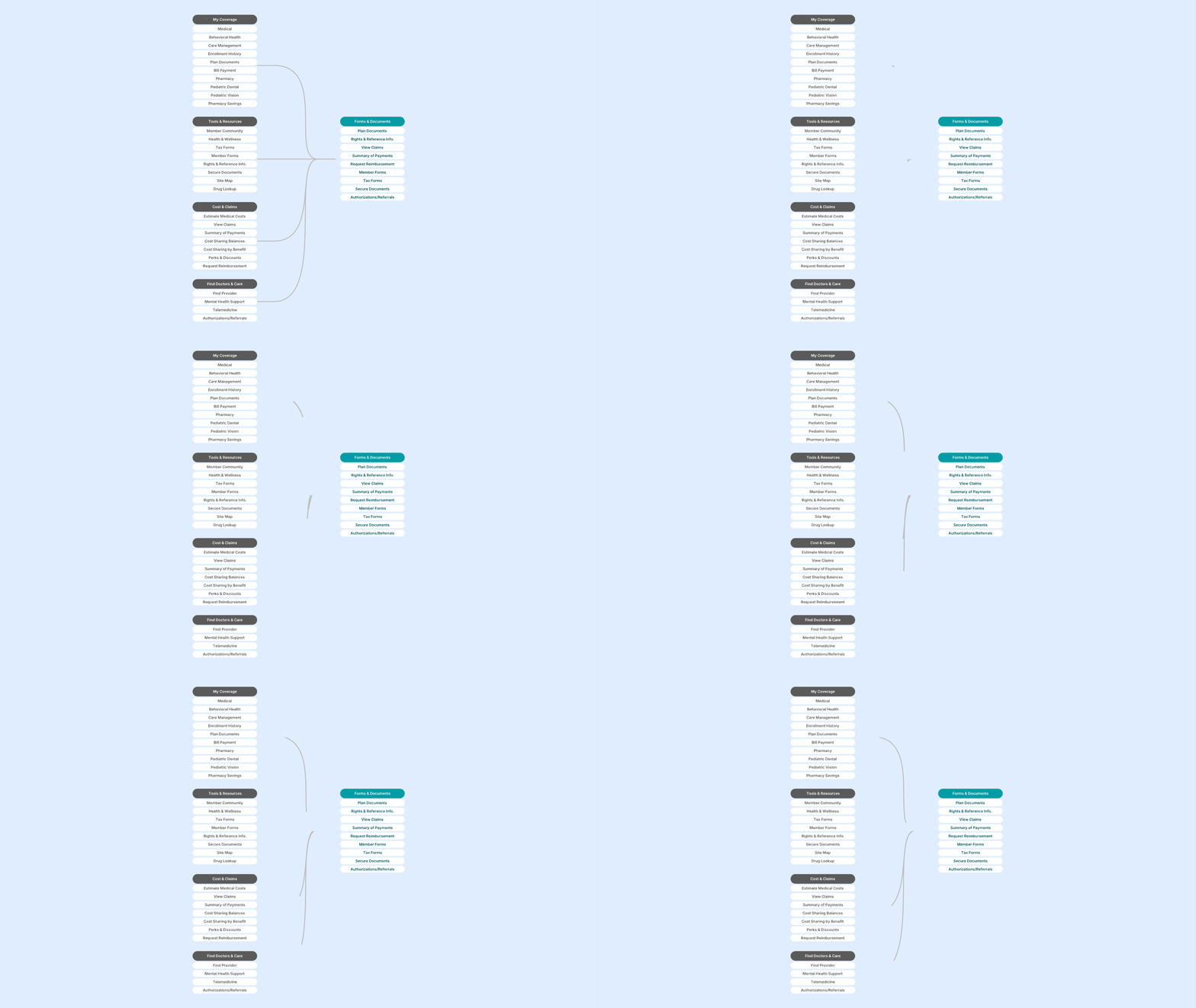
User research was the first step to restructuring the portal. Conducting a multiple-phased test, we landed on a new IA that improved findability significantly.
The Research
Option A

Option B

Option C

Option D

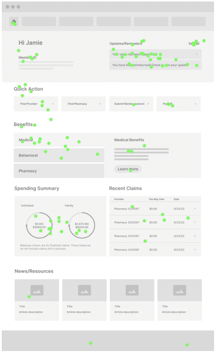
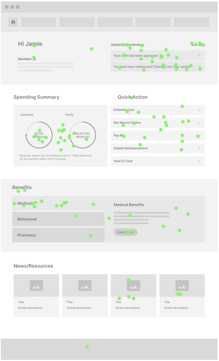
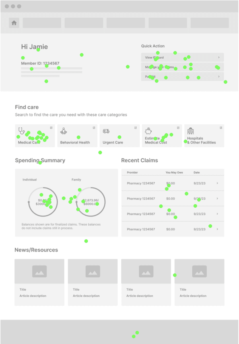
Designed and tested three homepage concepts with distinct focuses to determine which layout best supports member’s needs.
The Care-focused homepage won across every measure. 89% found it easy to navigate, 95% said the layout made sense, and 78% felt empowered to manage their care independently.
Benefits Focus
Financial Focus
Care Focus
Design Solutions
Surfacing Items in Multiple Places
Features like 'View Claims' fit multiple categories. Rather than forcing one location, we surfaced them wherever relevant.

Relabeling for Clarity
"Coverage & Benefits" clarifies what lives within
"Forms & Documents" centralizes downloadable materials
"My Account" aligns with common digital conventions

The redesigned IA was officially launched in April 2024
Phase 2 testing was clear: members came to the portal to find care first. So Find Doctors & Care became the first item in the navigation, not buried in the middle.

Impact
“This homepage would make me feel like my health insurance provider genuinely wants to empower me to manage my health care.”
Usability Test Participant
26%
Ease of finding information (35% → 61%)
16%
Self-service capability (44% → 60%)
16%
Overall member satisfaction (54% → 70%)
Second Intervention
Aug 2024 – Dec 2024 · Launched Jan 2025
Closing the Coverage Gap
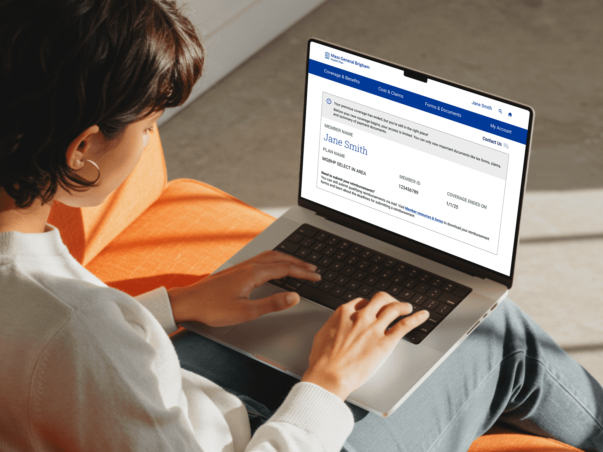
Every January, hundreds of members with expired plans couldn't reach their documents without calling customer service. The team manually emailed sensitive PHI to each one.
In August, leadership set a December deadline to find a solution. MGBHP's legacy design system added a hard constraint: no rewrite, just what already existed.
Design Solutions
Stripped to what they actually need
Former members need one thing: their tax documents. A status banner surfaced it immediately. Navigation cut from 25 items to 12. Visual design kept identical to the active portal — nothing new to learn.

Mobile-Web First
Rebuilding the native app under a December deadline wasn't realistic. We redirected former members to the mobile-web portal instead – same access, no rewrite, shipped on time.


Impact
The Post-Effective Portal was officially launched in January 2025
“You should have seen the Teams screen today 'light up' with hearts and applaud emojis when they demonstrated the post-effective member experience enhancement. It has made an impact and less activity to CS as a result :)”
Customer Service Manager
45%
Reduction in tax requests (400+ → 222)
ZERO
PHI email transfers (down from 400+)
Reflections
Users don't think in org charts
The old navigation mirrored internal structure. Rebuilding it around how members think about care drove the biggest gain in findability.
Security is a UX problem
Manually emailing PHI was not only a support burden, it was a security risk and a broken experience. Solving both at once made the case for design as a business function.
The data was already in the room
The 2023 survey held answers before the IA project started. The CS team held answers before the former-member project started. Treating existing data and frontline knowledge as research, not background, reshaped discovery.
Small changes, big results
The visual edits for former members were minimal. The impact was not. A focused portal cut call volume and freed the team for higher-value work.


Socializing the Change
I wrote quarterly release guides for the CS team – plain-language summaries of what changed and why – so they could answer member questions without escalating every call.