
Redesigning the Information Architecture
Streamlined the information architecture, helping members navigate with 26% more clarity and feel 16% more satisfied overall
Mass General Brigham Health Plan delivers accessible, member-centered healthcare experiences through integrated insurance and digital service platforms.
Role: UX Designer | Usability Testing, Research Analysis, UI/UX, IA
Team: UX Lead, Director of Customer Experience, PM, Engineering Team
Project Timeline: 3 months (Nov 2023 - Jan 2024)
Platform: Web, Mobile
Background & Problem

In a 2023 survey, we found that fewer than 20% of MGBHP members used the portal, and among those who did, most could not complete basic actions — 65% struggled to navigate the portal and 62% could not easily locate benefits or documents. These usability gaps led members to frequently call for support.
Challenge
How might we redesign the portal to help members feel informed, capable, and confident in managing their health benefits independently?
Preliminary Discovery
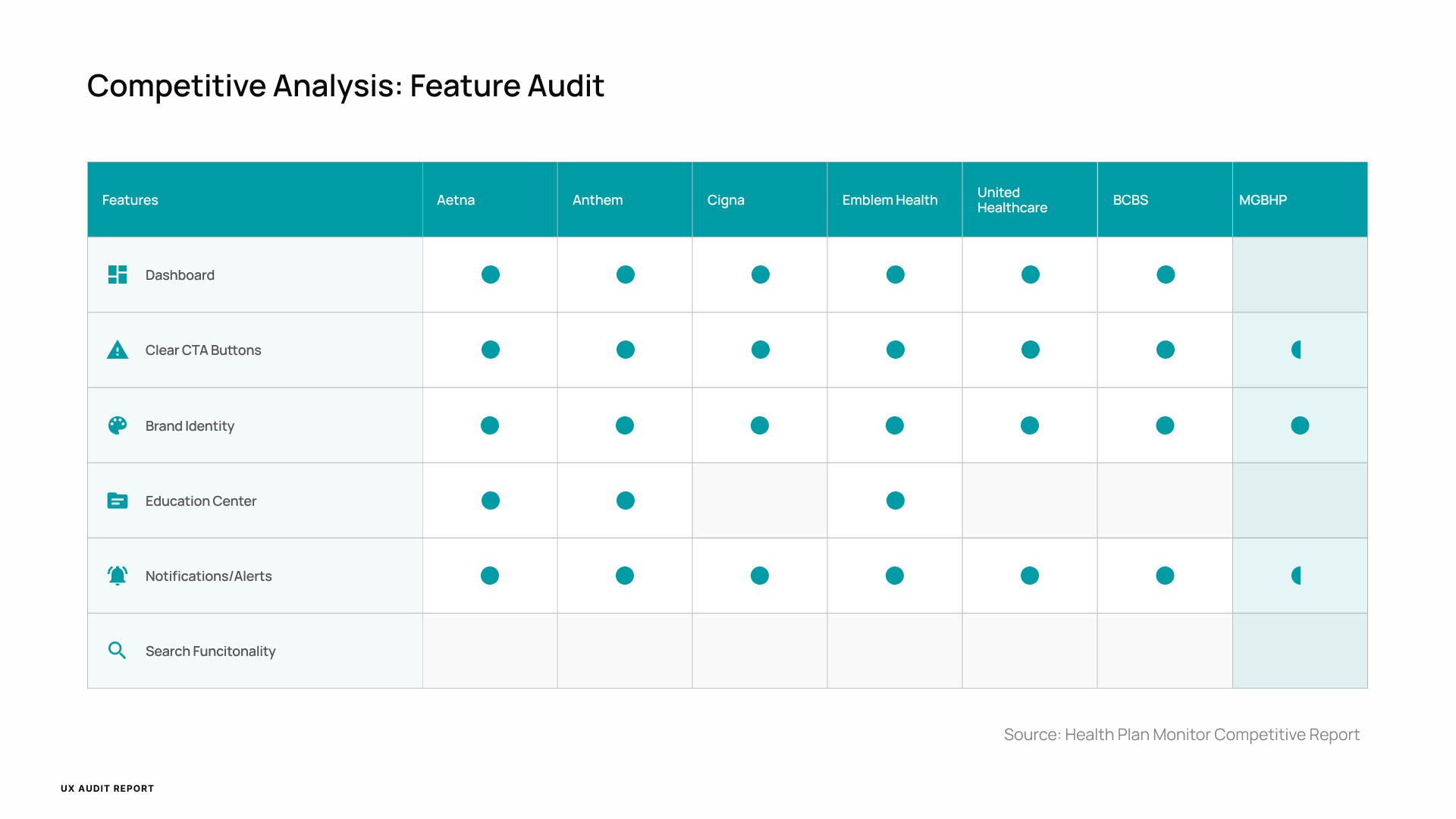
To understand why members struggled, I investigated our member surveys and completed a competitive audit of top healthcare portals (ie. Aetna, Anthem, Cigna, Emblem Health, United Healthcare, Blue Cross Blue Shield).
This helped us uncover key usability pain points in our portal:
Overly complex navigation structure with unclear menu labels
Scattered benefit information hidden within deep subpages
Homepage design that prioritized internal hierarchy over user goals
From the survey data, one insight stood out:
Members didn’t feel “in control.” They wanted to see their care at a glance and act quickly without contacting support.
Three Phases of Usability Testing
Guided by our preliminary discovery insights, I designed and implemented three phases of usability testing to validate new design directions before full-scale implementation. EmpatiX, our research operations partner, supported participant recruitment and moderated sessions.
Each phase focused on a key area of improvement for the member portal and mobile app experience.
Phase 1: Categorization &
Navigation Exercise
To address the most critical barrier—our confusing navigation—we facilitated our large-scale card sorting and navigation exercises with over 100 participants.
Phase 1 Objective
To understand how users naturally group and label information when navigating our healthcare portal.
Participants were asked to:
Categorize existing menu items into logical groups.
Choose where they would navigate to find specific health-related information.
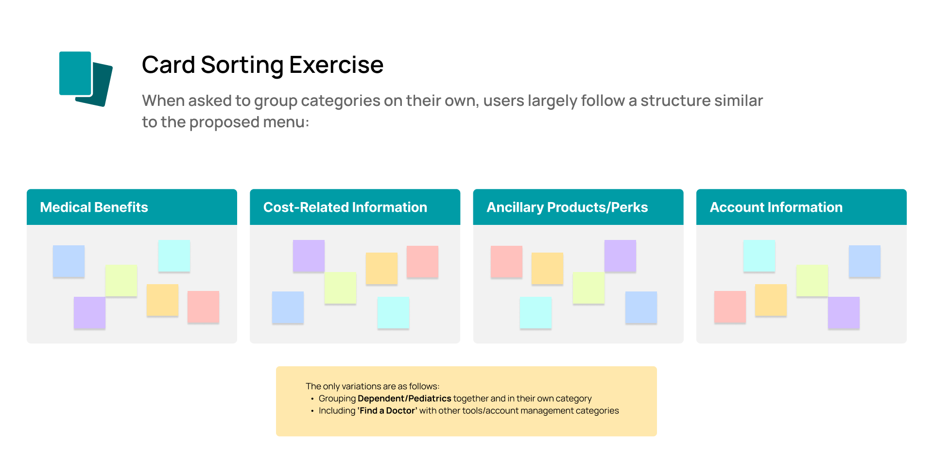
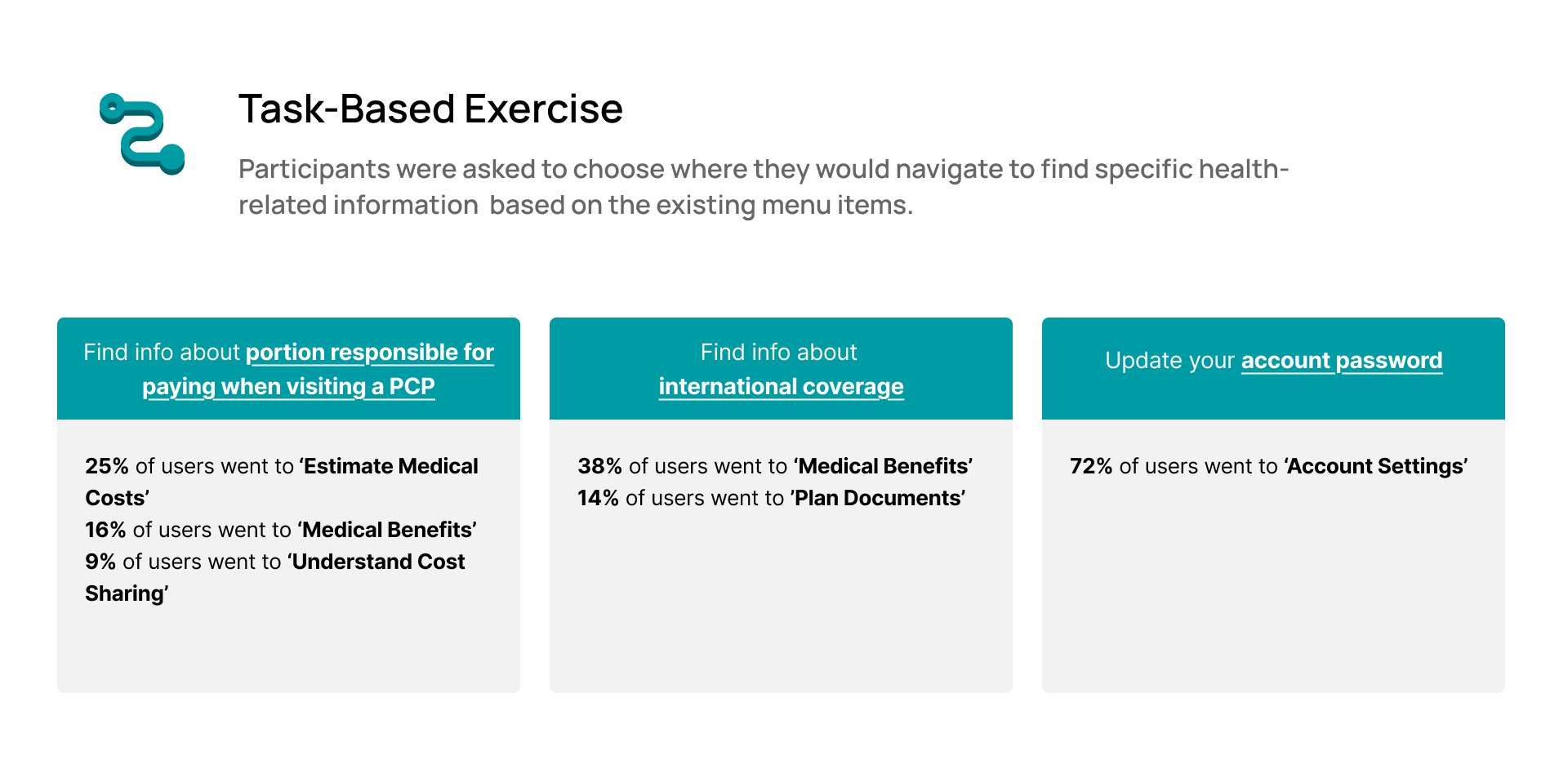
Through this process, a clear pattern emerged: users expected the portal to mirror their mental model of healthcare needs, not the company’s internal structure.
Our key takeaway was simple yet powerful:
Navigation must reflect how users think, not how we organize.
This insight drove a full IA restructuring to align the portal with how members search for benefits and complete tasks.
A
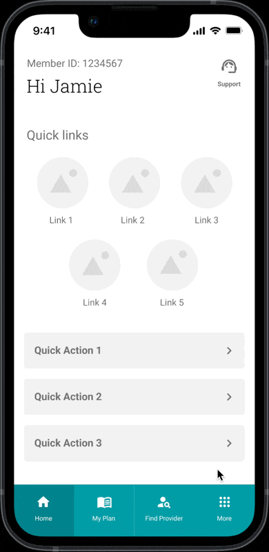
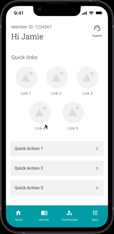
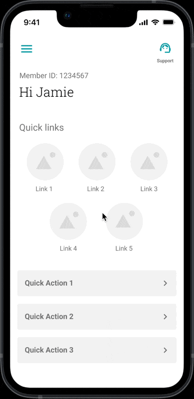
Phase 2: Mobile Navigation Menu Testing
The second round of usability testing focused on mobile navigation design.
I designed four distinct menu designs that explored different hierarchies, groupings, and visual patterns. Each prototype reflected a unique structural hypothesis, from grid-based layouts to simplified vertical menus.
Objective
To determine which layout best supported members in quickly locating key actions within the app.
Participants were asked to:
Rank which design they preferred.
Rate how easy it was to navigate.
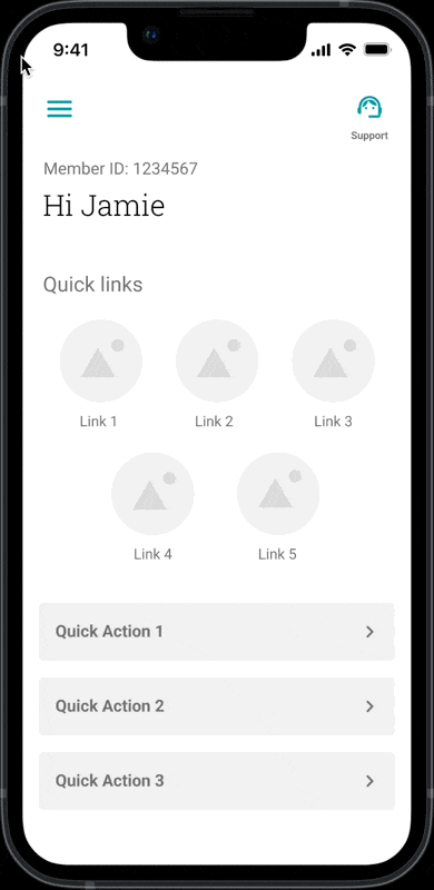
B
C
Results
Top Choice - C
Among the four prototypes tested, Design C emerged as the leader — receiving 32% of overall preference and the highest ease-of-navigation score at 82%.
Participants described it as “simple,” “clean,” and “logical,” noting that the vertical layout made it easier to scan and access key sections without unnecessary taps.
Our key takeaway:
Users prefer clarity over novelty. Design C validated that simplicity, clear labeling, and reduced cognitive load drive user trust and ease of navigation in healthcare experiences.
D
Phase 3: Homepage Redesign Validation
After validating navigation and structure in the previous phases, I shifted focus to the member portal homepage, the first touchpoint of the user experience.
To explore this, I designed and tested three homepage concepts, each reflecting a different approach to information hierarchy and member intent.
Objective
To determine which homepage layout best supports members’ needs and helps us prioritize the right tools and information upfront.
Participants were asked to:
Select which design felt most helpful and explain why.
Focus on the test measured ease of use, clarity of layout, and relevance of information to their typical tasks.
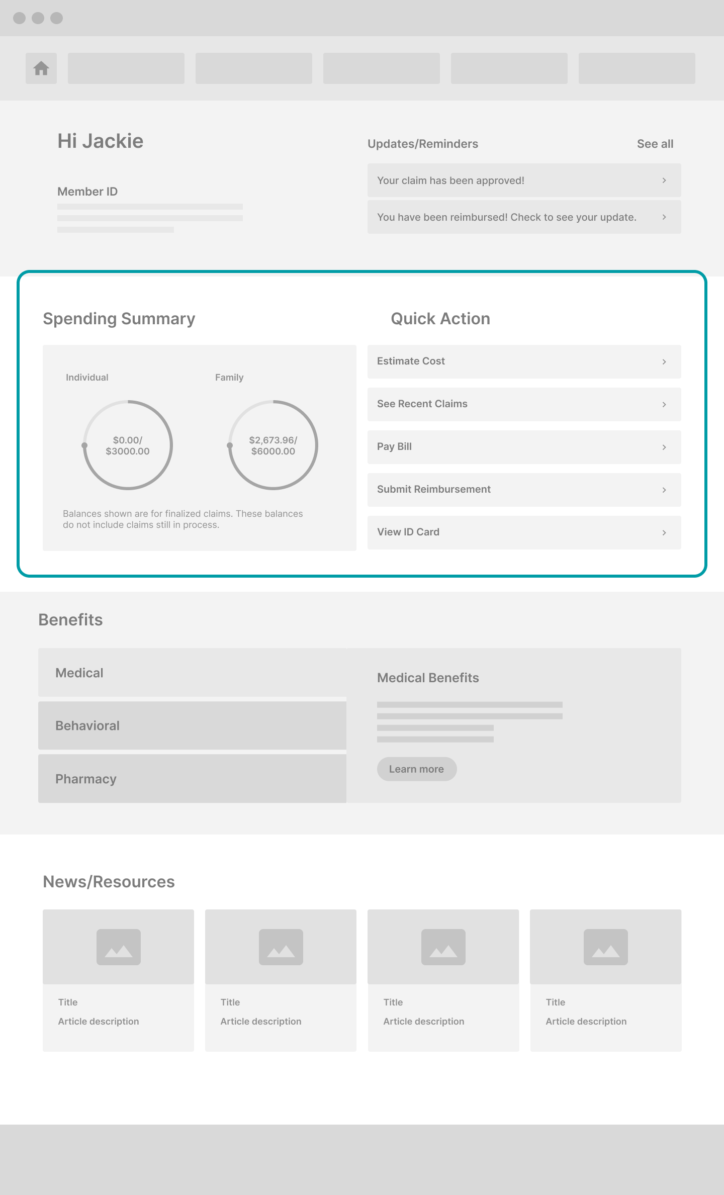
Benefits Focus
Prioritized plan benefits and coverage details at the top.

Financial Focus
Prioritized accumulators, claims, and payment information at the top.
Heatmap for Care-Focus Wireframe
Care Focus
Prioritized provider search and care navigation tools at the top.

Results
Top Choice - Care

| Metric | Why It Matters | Care-Focused Insight |
|---|---|---|
| Ease of Navigation | Builds confidence and reduces friction in task flow. | 89% of users found it easy to navigate. |
| Layout Clarity | Minimizes cognitive load and improves content comprehension. | 95% said the layout “made sense,” the highest across all wireframes. |
| Empowerment | Increases user confidence and sense of control. | 78% felt empowered to manage their care (+5% higher than others). |
| Brand Favorability | Strengthens emotional trust and perception of reliability. | 71% reported a +7-point boost compared to others. |
| Usefulness | Connects perceived utility to engagement and retention. | 64% rated it extremely/very useful (+11% higher than others). |
The Care-Focused homepage consistently outperformed other versions across usability and perception metrics.
What Users Said
“This homepage would make me feel like my health insurance provider genuinely wants to empower me to manage my health care”
| Positive Insights | Improvement Opportunities |
|---|---|
| “It’s easy to see everything important — ID cards, claims, and doctors.” | “Add a section for Dental and Vision care.” |
| “Everything is grouped and labeled clearly — very reassuring.” | “Provide more tailored health information.” |
| “Straight and to the point — I don’t have to click around.” | “Move graphs higher; surface key actions sooner.” |
Our key takeaway:
The Care-focused homepage validated that users want immediate visibility into their most important tasks — finding care and managing health.
Implementation & Design
After multiple rounds of testing, it became clear that our information architecture (IA) wasn’t supporting how users actually thought about their tasks. Instead of reflecting our users’ needs, our IA was confusing and scattered.
Our first step was to reorganize and consolidate.
Step 1: Grouping what belongs together
Users jumped between My Coverage, Tools & Resources, Cost & Claims, and Find Doctors & Care when searching for forms and documents — unsure which section held what they needed. This overlap created unnecessary friction and confusion. By grouping these pages under one clear destination, we simplified navigation for the user’s needs.

Step 2: Making sure users reach their goal
During our Phase 1 Card-Sorting analysis, some features — like “View Claims” — naturally fit under multiple categories. Instead of forcing a single location, we surfaced it in both Forms & Documents and Cost & Claims. This ensured that no matter which path users chose, members could complete their task.
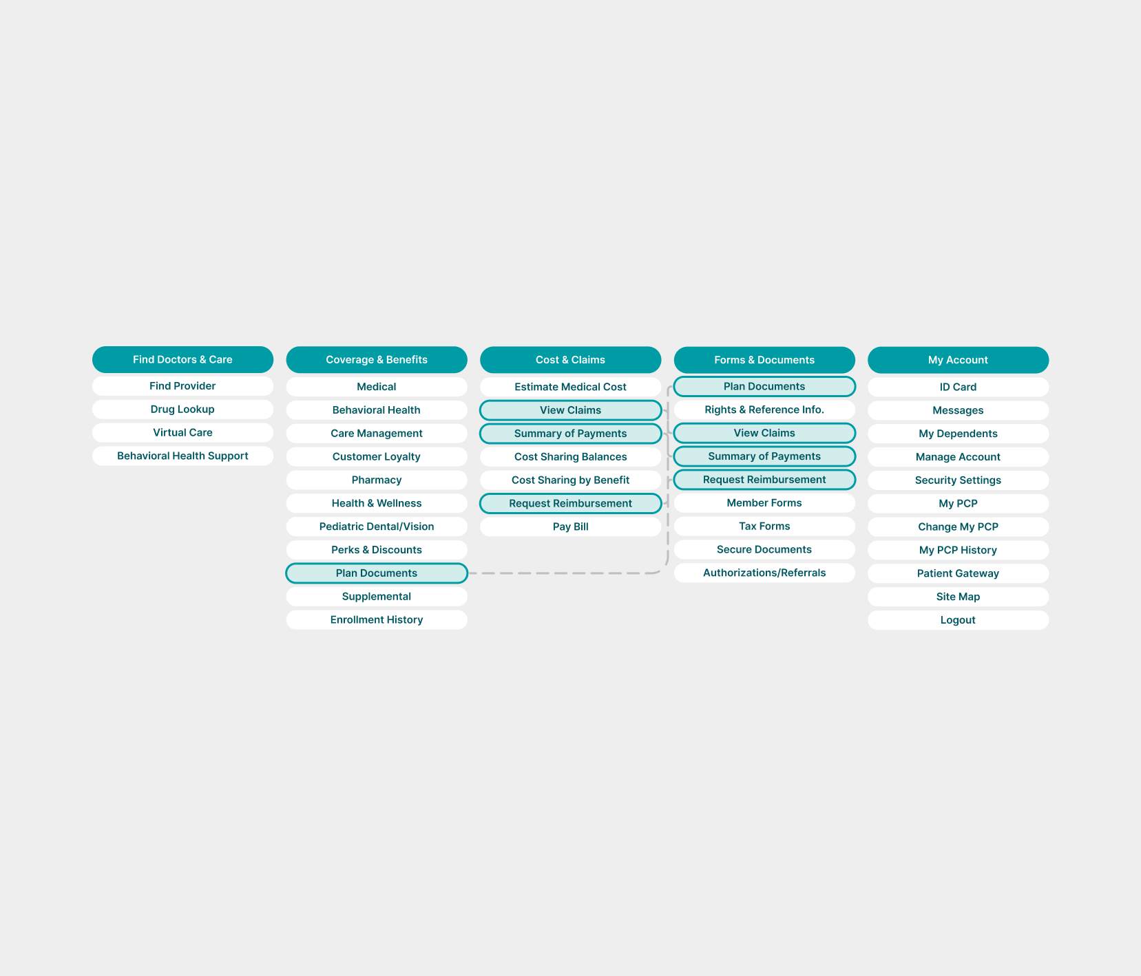
Step 3: Turning insights into reality
Phase 3 testing showed that most members came to the portal to find care first, so I moved Find Doctors & Care to the top of the navigation for immediate visibility.
I also refined the remaining labels to better match user expectations:
My Coverage → Coverage & Benefits for clarity on what lives there
Tools & Resources → Forms & Documents to create one central place for downloadable materials
My Profile → My Account to align with naming conventions found in other digital products

The redesigned IA was officially launched in April 2024.
Although the homepage and mobile redesigns were not yet completed, they informed future feature planning and product strategy.
Impact
After the launch of the new IA, our follow-up survey revealed measurable improvements across all key metrics, marking a pivotal step toward rebuilding user confidence in the digital experience.


| Metric | 2023 | 2024 | Δ |
|---|---|---|---|
| Ease of finding information | 35% | 61% | +26% |
| Ability to answer questions without assistance | 44% | 60% | +16% |
| Overall member satisfaction | 54% | 70% | +16% |
Reflection
This project reminded me that small changes can move mountains. By designing for how members actually search, we created a clear path through the portal. The updates helped people find what they need faster and make sense of their health benefits, a topic that’s confusing for most.
Looking ahead, the validated homepage and app redesigns set the foundation for MGB’s next phase: expanding self-service tools and making every interaction feel more intuitive and supportive.